
Here are some key features of the new logo:
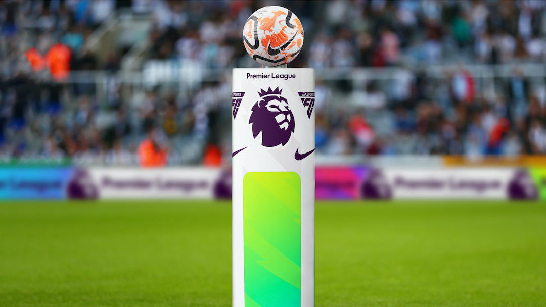
- Simplified design: The new logo has been set free from the wordmark, with greater emphasis on the lion icon. The lion has been redrawn to be more streamlined and modern, with a more dynamic pose
- No football-related visual cues: Unlike the previous logo, which featured a football, the new design does not have any obvious football-related visual cues. This represents a clean break from traditional heraldic sporting imagery and gives the logo a more timeless quality.
- Distinctive color palette: The new logo features a distinctive color palette of purple, white, and black. This sets it apart from other football league logos, which often use more traditional colors like red and blue.
- Clean and modern aesthetic: The overall design of the logo is clean and modern, with a focus on simplicity and iconicity. The removal of the wordmark allows the lion icon to stand out and be more recognizable.


The design is clean, modern, and distinctive, and sets the league apart from its competitors. While some may argue that the lack of football-related visual cues makes the logo less immediately recognizable, the new design is sure to become an iconic symbol of the Premier League in the years to come.
Who is Nomad Studio ?
Nomad Studio is a creative agency that offers services in branding, interpretive planning, exhibit design, and creative advertising. They have clients from around the world and are experts in Sport, Media & Entertainment branding. They are based in London, UK.
*Images credit: nomadstudio.com
Comments
Post a Comment